
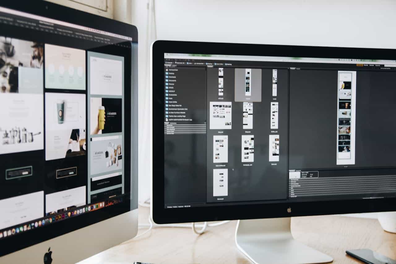
A sharp, professional travel website design can grab attention fast. But if the rest of your client experience feels messy or off-brand, that early trust slips away just as quickly. Your website might feel polished and clear, while your emails, proposals, itineraries, and social posts still look like they came from four different businesses.
We see this all the time with travel agencies and advisors. The site is doing its job, but everything around it feels scattered. This article walks through how to fix that with what we call a Brand Consistency System, so your entire client experience feels aligned, calm, and premium, even when you are deep in busy season.
Turn One-Time Visitors Into Loyal Travel Clients
A strong website is not the whole brand experience; it is the entry point. People land on your site, love what they see, and send an inquiry. Then the cracks start to show. The email reply looks plain, the proposal is a clunky PDF, and the itinerary could belong to any agency.
That gap is where trust leaks out.
Now think of a traveler going from your Instagram post, to your inquiry form, to your pre-trip email, to the final printed or digital itinerary. Every step feels like the same brand. Same tone, same design cues, same level of clarity. Nothing feels random or rushed. That kind of consistency:
- Builds trust without you having to “sell”
- Reduces questions and confusion
- Makes your agency feel steady, thoughtful, and high-end
We call the system behind this a Brand Consistency System. It is a practical framework that connects your professional travel website design with:
- Email touchpoints
- Proposals and quotes
- Itineraries and travel documents
- Social content and stories
The goal is not perfection. The goal is a repeatable way to keep your brand aligned, even when your calendar is packed.
Why Your Website Cannot Carry Your Brand Alone
Many travel brands lose the thread right after the homepage. The website is polished, but then we see:
- Mismatched email signatures
- Proposal templates with different fonts and colors
- Itineraries that look DIY or confusing
- Social posts that feel random instead of intentional
Clients pick up on this, even if they cannot explain it. One touchpoint feels luxury, the next feels budget. One email sounds formal, the next sounds super casual. It leaves them wondering what level of service they are actually buying.
The hidden cost shows up right before they are ready to commit. If the proposal is hard to read, or the itinerary looks sloppy, doubt creeps in. That doubt can slow decisions, invite more comparison shopping, or make them hold off on higher-end trips.
On the flip side, when everything feels aligned, clients feel safe saying yes to bigger, more complex travel plans. They feel like you have your act together.
Your professional travel website design sets the tone here. It is the north star for:
- The visual style, like colors, fonts, and imagery
- Voice and personality, like how you talk about travel and service
- Structure, like how you lay out information and calls to action
Once the site is dialed in, the smart next step is to extend that clarity to every other client-facing asset, especially before peak booking seasons like late spring and early summer.
Build a Brand Consistency System That Works Under Pressure
You do not need a giant corporate brand book. Start with a simple core brand toolkit that you and your team will actually use. At minimum, capture:
- Color palette with a primary, secondary, and accent color
- Two or three fonts and where to use each
- Image style, such as warm, candid, or editorial
- Logo usage rules, including what not to do
- Voice and tone notes, such as “warm, clear, confident”
- A few key phrases that explain who you serve and how you work
Next, map your end-to-end client path. It might look like:
- Discovery, social, referrals, search
- Inquiry form and first email reply
- Consultation and follow-up
- Proposal and contract
- Itinerary and travel documents
- Post-trip follow-up and review request
Mark where your brand already feels strong and where things feel rushed or pieced together. Those weaker spots are where you will see the biggest wins from a system.
Then, turn your toolkit into reusable frameworks, not stiff rules. Think:
- Email reply sequences for common moments
- A consistent proposal structure
- A standard itinerary layout
- A handful of social post types
Frameworks give you freedom inside clear lines. You still tailor each trip, but you are not reinventing the layout, design, or voice every time, which matters a lot when your inbox is full and you are juggling overlapping departure dates.
Extending Your Website Brand Into Email and Proposals
Email is often the first one-on-one contact with a client, so it should feel like a natural extension of your site. Align simple things like:
- Header or logo placement
- Fonts and spacing
- Sign-off style and contact details
- Little brand touches, such as a tagline or short note about your process
Key email types to bring into your system include:
- Inquiry replies
- Consultation confirmations
- Pre-trip prep and reminders
- Post-trip check-ins and review requests
When these all share the same style and voice, clients feel grounded. They recognize you in their inbox and know what to expect.
Proposals should feel like a preview of the experience you are selling, not just a price sheet. Use your site as inspiration so proposals have:
- Clear, repeatable sections
- Consistent headings and subheadings
- Scannable pricing and inclusions
- Simple calls to action, such as how to approve and pay
Clarity is everything here. A client should quickly understand what is included, what is not, and why this plan fits their goals. Borrow layout ideas from your site, such as hero-style intros, benefit-focused headings, and destination imagery that matches your niche.
Branded Itineraries and Social Content That Tell One Story
Your itinerary should feel like part of the trip, not just paperwork. Even if you use a third-party tool, you can shape the brand feel with:
- A consistent cover page or intro screen
- A clear day-by-day layout that repeats
- Icon and map styles that echo your site
- Photography that matches your usual look and feel
When itineraries are clean and simple to follow, clients feel cared for before they even board the plane. It lowers pre-trip stress and makes your service feel more thoughtful.
For social, pick a small set of repeatable post frameworks so you are not starting from zero each time. For example:
- Trip recaps
- Client stories or quick testimonials
- Destination spotlights
- Packing or prep tips
- Behind-the-scenes planning peeks
Keep the visuals anchored to your brand colors and image style, and write captions in the same voice as your site copy. This makes discovery-to-booking feel like one connected story.
Planning for seasonality helps too, especially as warmer weather hits and more people start thinking about summer vacations. Batching content like “Summer Europe highlights” or “Tropical winter escape ideas” inside your set frameworks lets you show up consistently without scrambling.
Turn Brand Consistency Into a Daily Operating Habit
A Brand Consistency System only works if it lives in your daily rhythm. Simple habits go a long way, like:
- Monthly quick checks on emails and proposals
- Seasonal refreshes of photography and sample trips
- Spot-checking for old fonts, colors, or outdated offers
Give someone ownership of this, even if it is just you with a calendar reminder.
There are times when it makes sense to revisit both your website and your supporting system together. For example, when you:
- Shift your niche or destination focus
- Start working with higher-end or more specialized travelers
- Add new services or trip types
Updating your professional travel website design and your Brand Consistency System at the same time keeps your evolution clear and cohesive across every touchpoint. That is the kind of alignment that turns casual visitors into long-term, referral-happy clients, season after season.
Transform Your Travel Brand Into A Bookings-Driven Powerhouse
If you are ready to attract more travelers, we can craft a tailored professional travel website design that showcases your destinations and converts visitors into bookings. At Suitcase Designs, we focus on clear user journeys, fast performance, and visuals that match your brand. Tell us about your goals and audience, and we will translate them into a site that works as hard as you do. If you are prepared to start your next project, contact us today.


